Releases: arnaudvolp/shadcnship
Releases · arnaudvolp/shadcnship
Release list
Shadcnship@1.1.5

Summary
Release 1.1.5 ships 4 new component blocks across the contact, feature, and testimonial categories — all built with shadcn/ui defaults, theme tokens, and typed props.
New Component Blocks
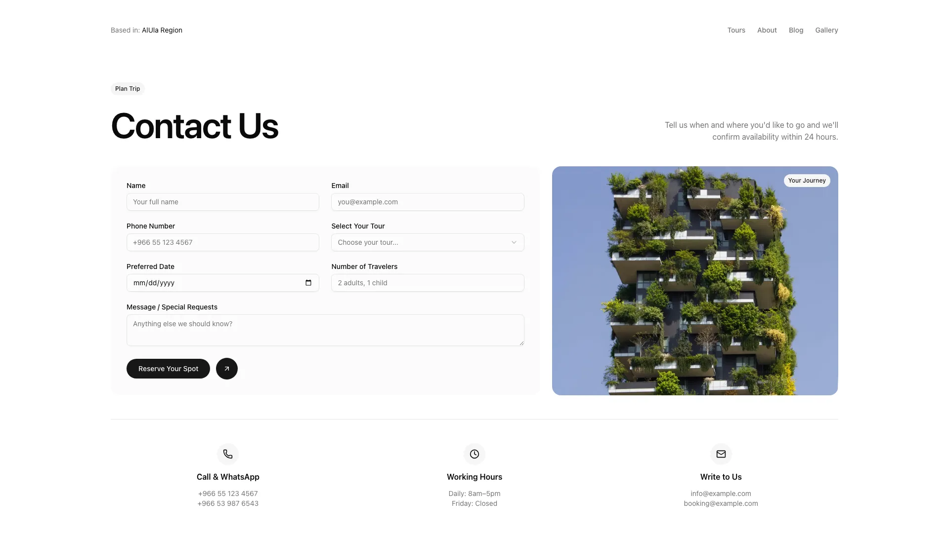
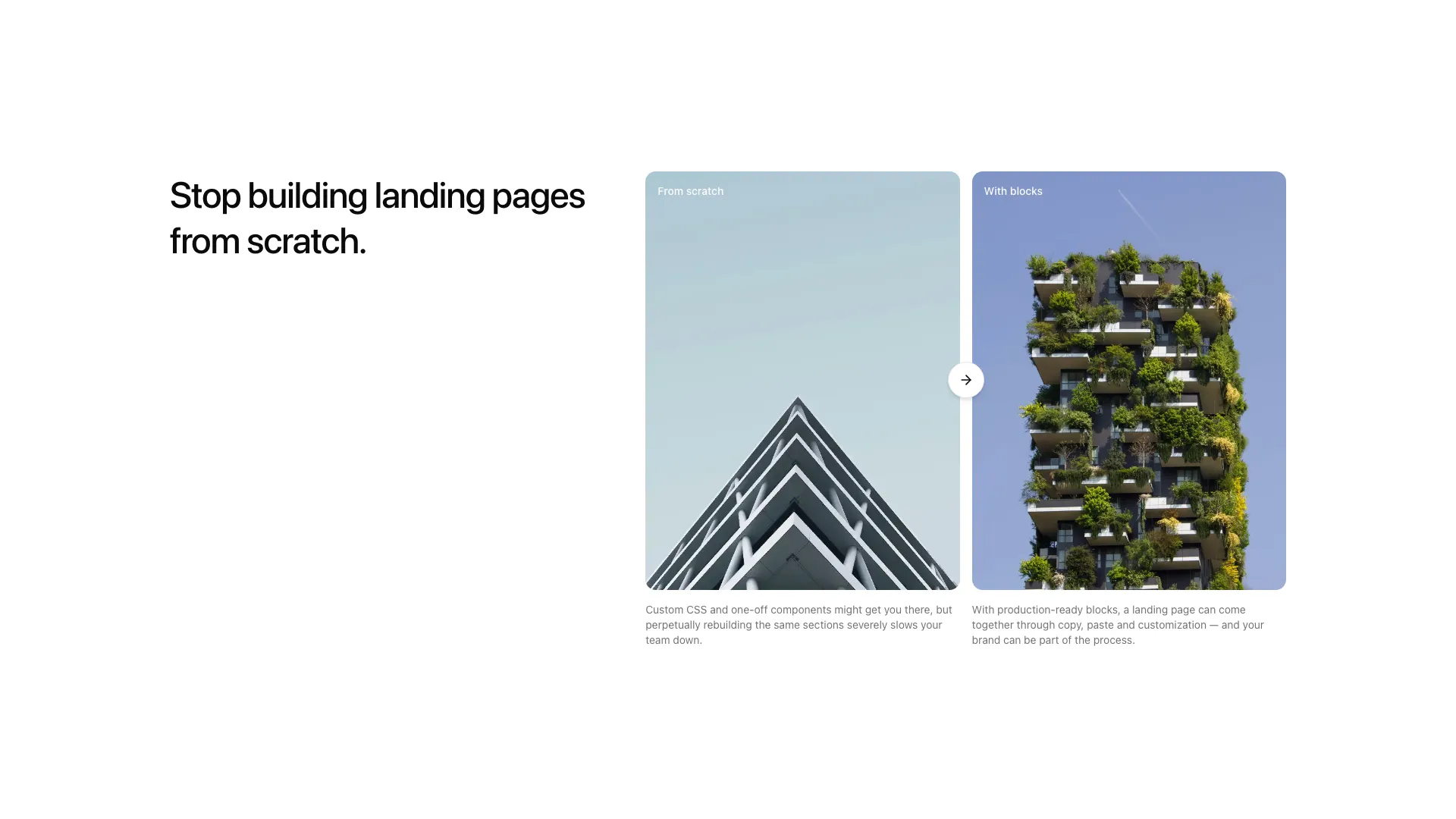
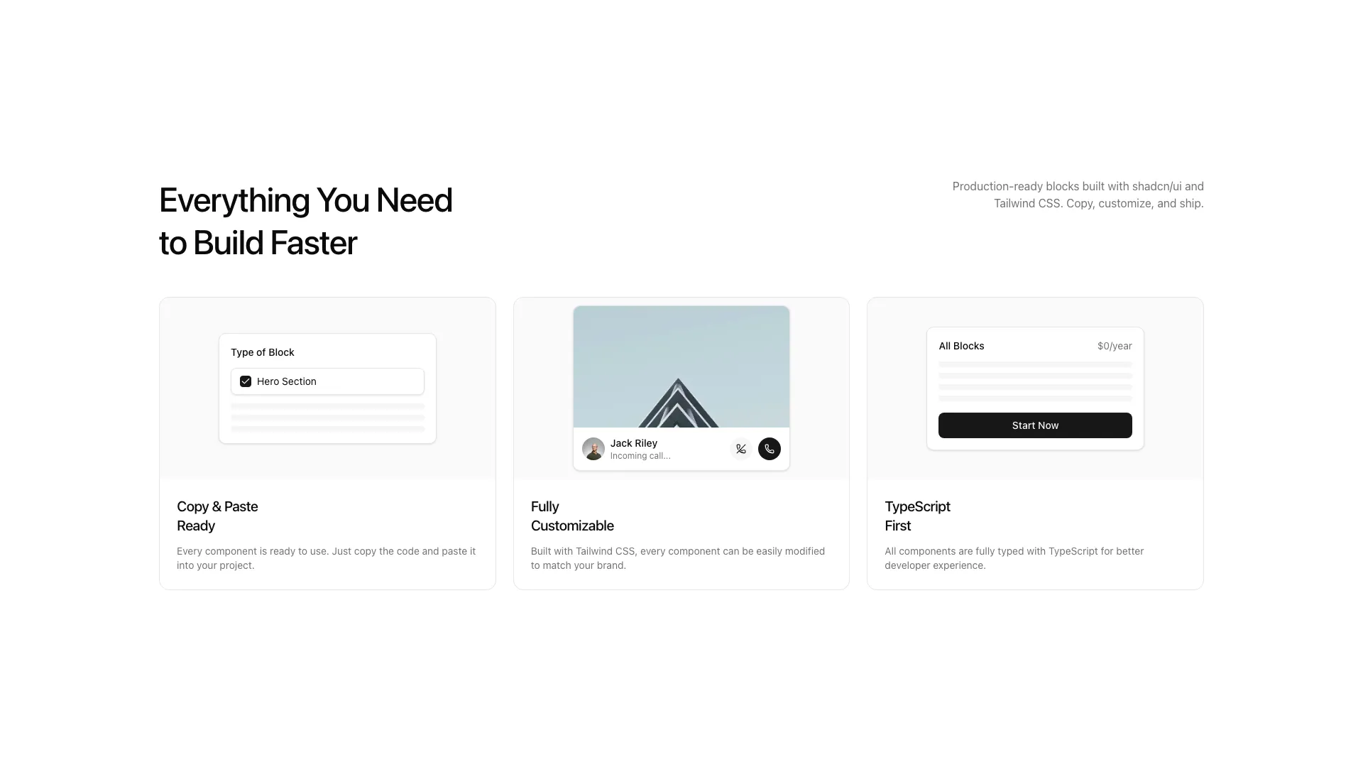
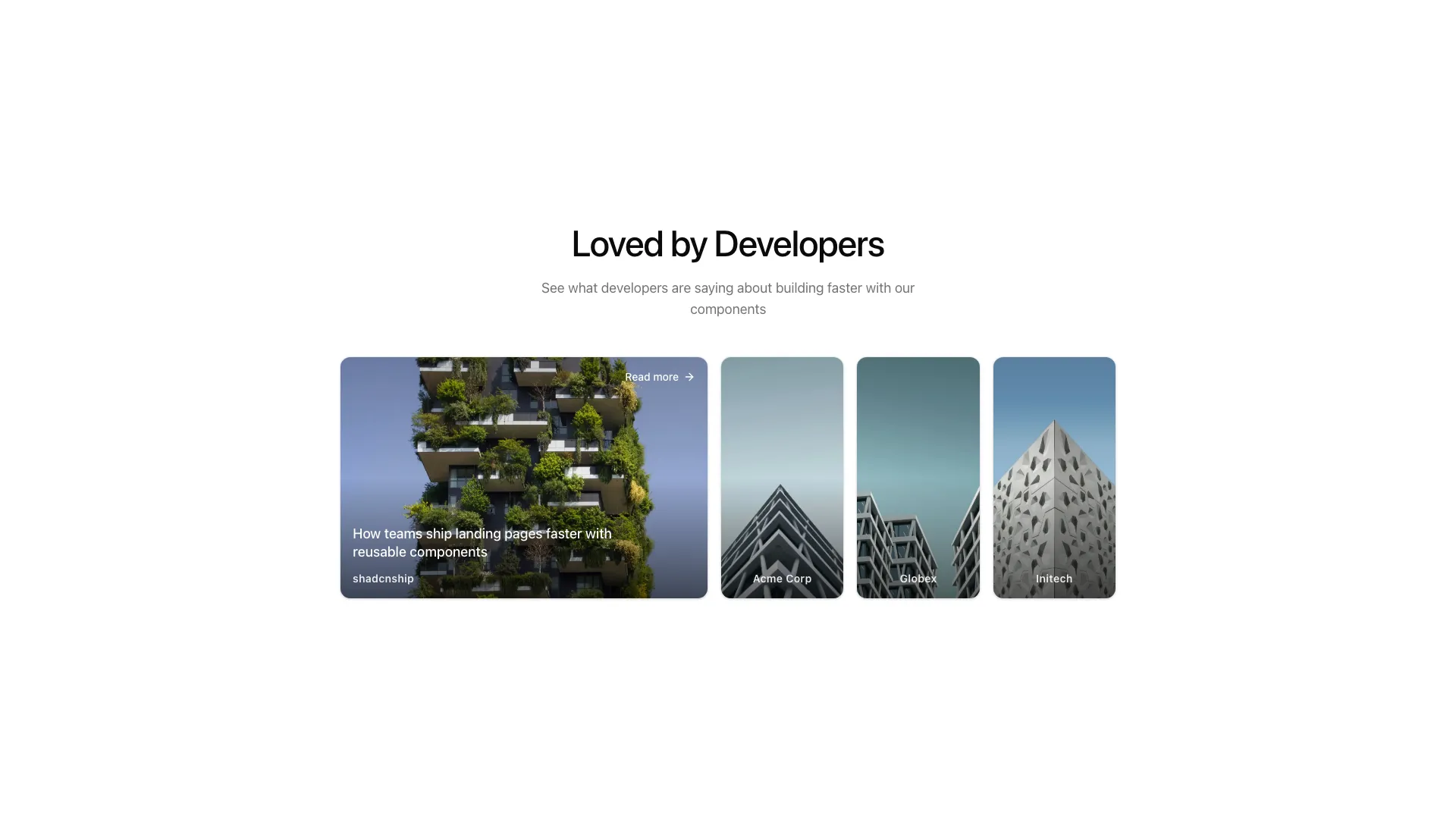
contact-02— pro split contact form with tour select, image slot, and centered contact info stripfeature-19— editorial split comparison with two image panels and a circular arrow buttonfeature-20— 3 cards with decorative UI mockups (form, call, pricing)testimonial-04— gallery of brand cards that expand on hover
Previews
Shadcnship@1.1.4
Summary
Release 1.1.4 ships 11 new component blocks across the hero, feature, stats, and CTA categories — all built with shadcn/ui defaults, theme tokens, and typed props.
New Component Blocks
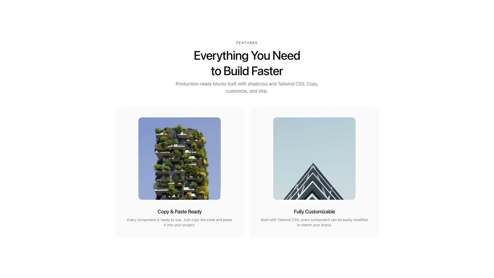
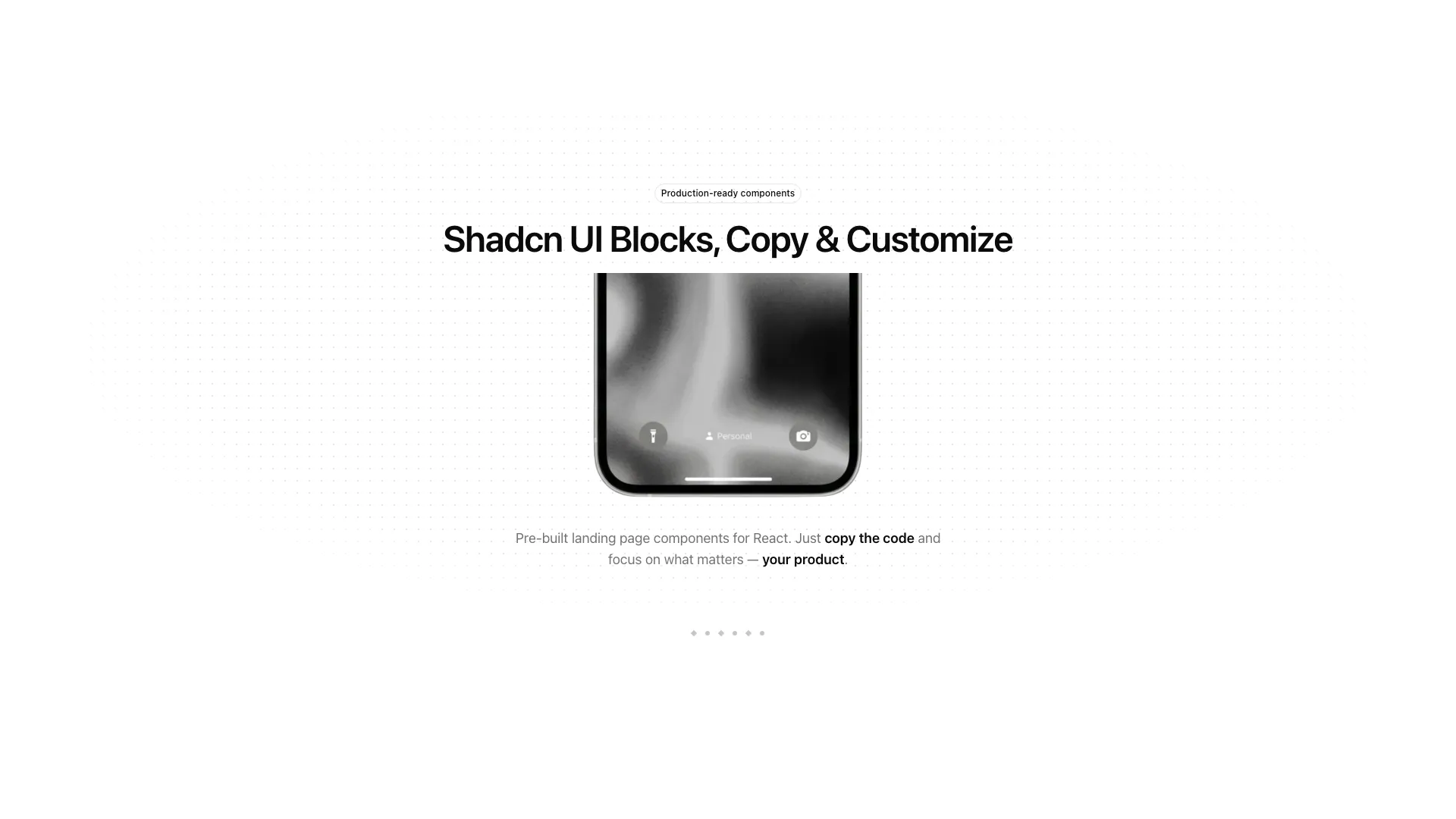
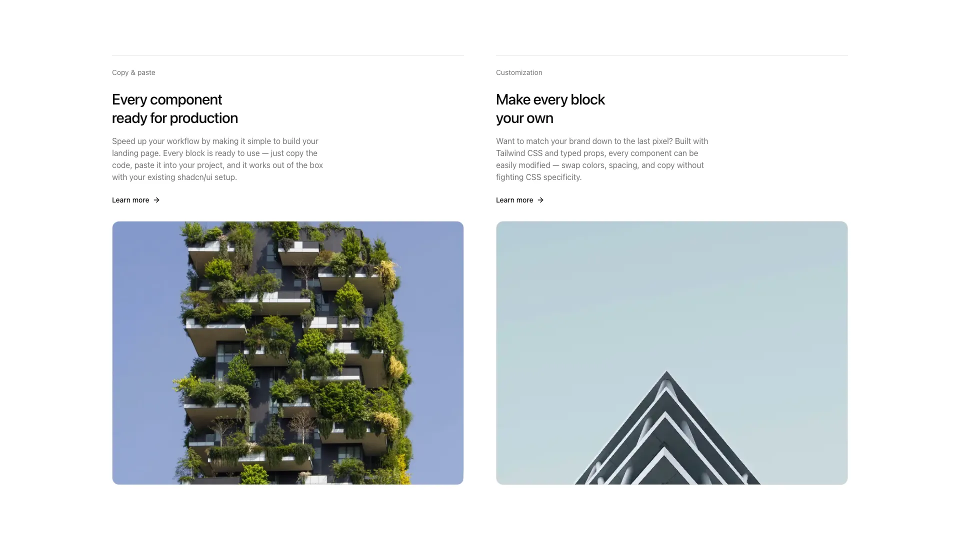
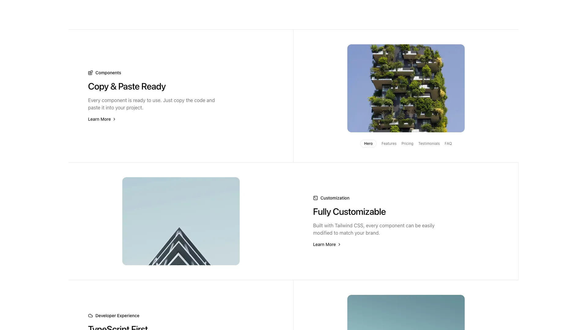
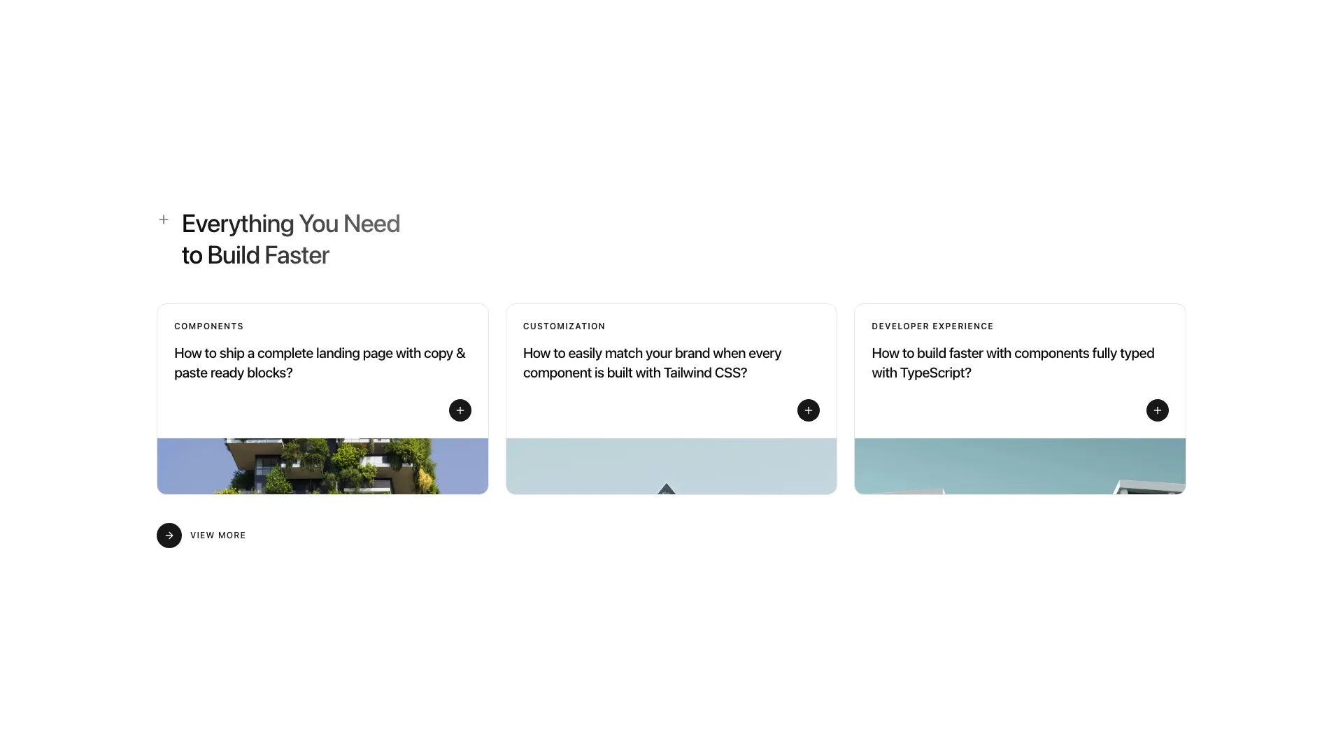
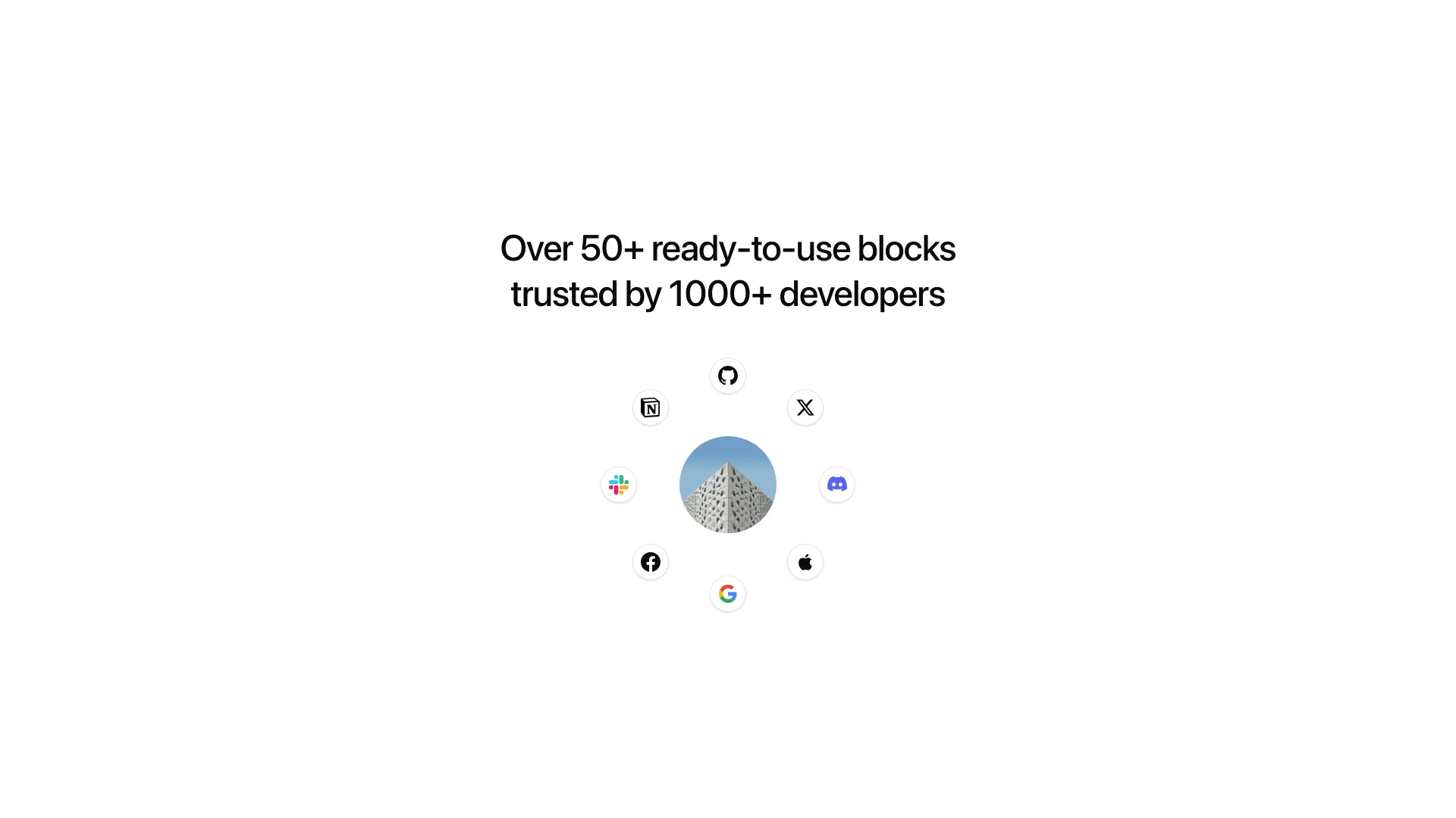
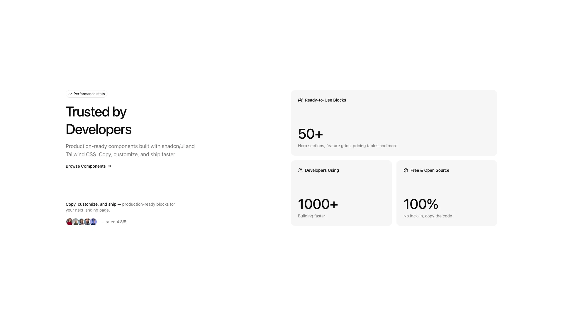
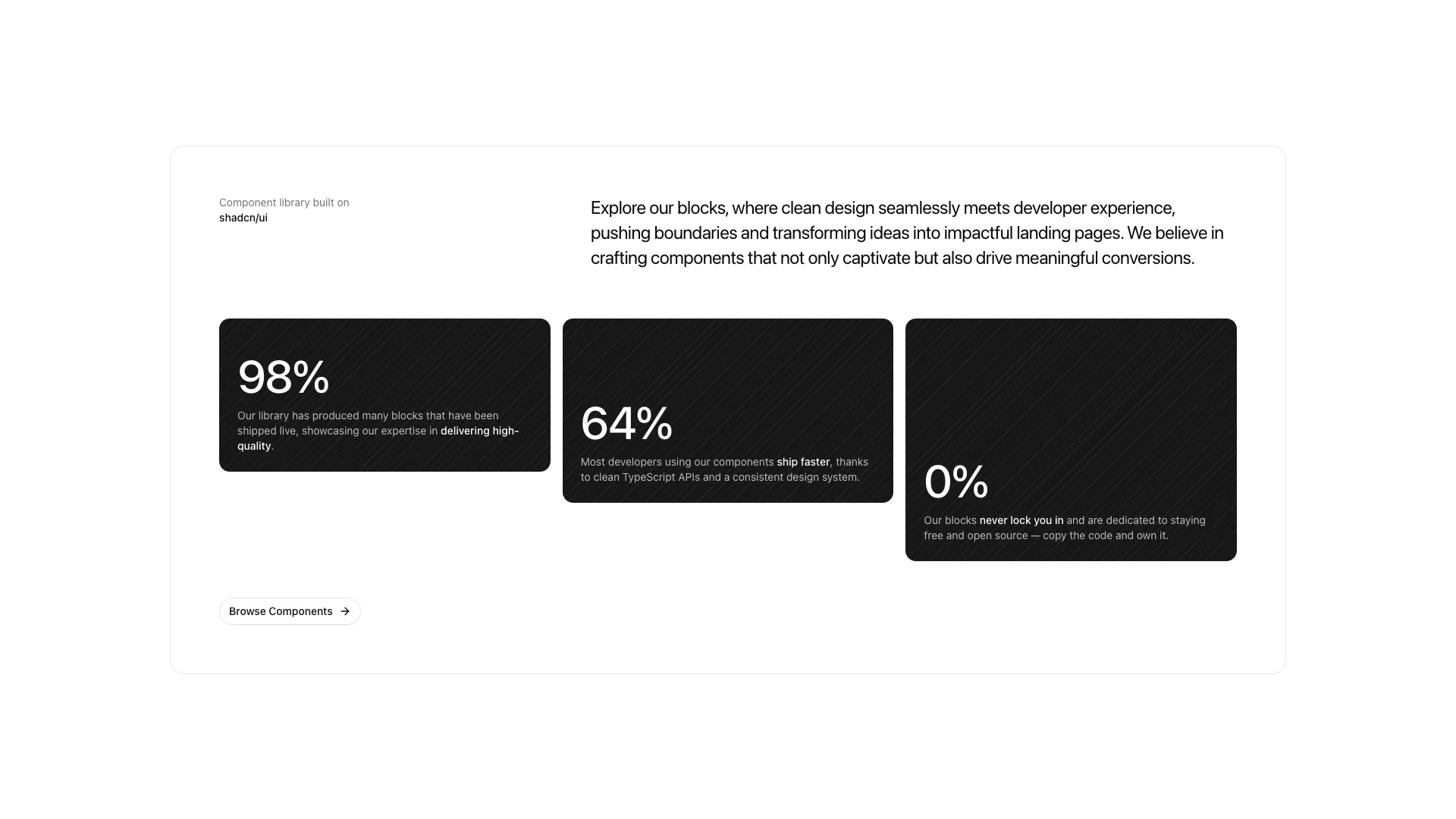
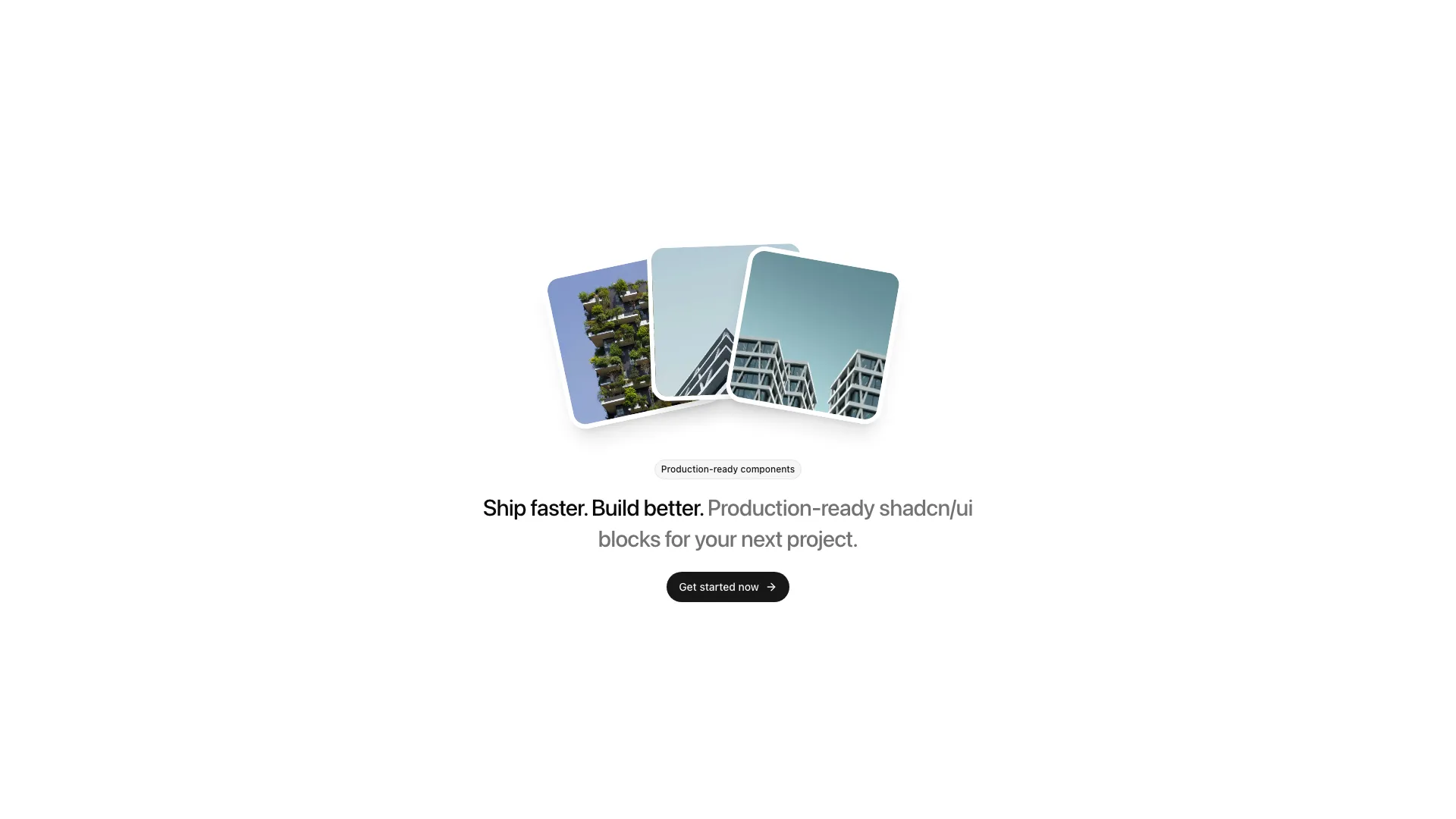
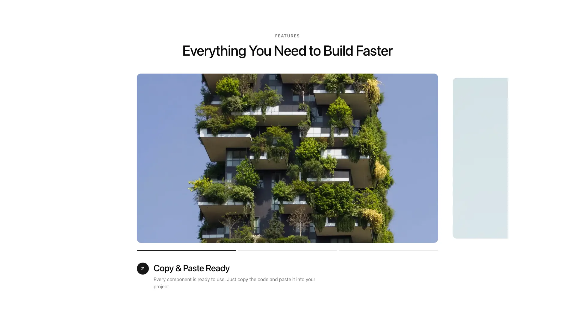
hero-06— full-screen centered hero with background imagefeature-13— carousel with progress tabs and step detailsfeature-14— 2-column grid of image cardsfeature-15— centered section with phone mockup on dot patternfeature-16— 2-column split with labels and learn-more linksfeature-17— alternating grid with thin borders and category tagsfeature-18— case-studies cards with gradient titlestat-04— icons orbiting a center avatarstat-05— split stats with asymmetric metric cardsstat-06— dark hatched cards with percent-driven heightscta-05— fanned photo stack with pill button
Previews
Shadcnship@1.1.3.2
New Blocks:
- Image Compare — A before/after image slider with a draggable vertical divider. Lets
users reveal two images side by side in real time, with labeled pills and a circular
handle. - Testimonial-03 — A testimonial carousel with a previous-card sidebar, a center
portrait photo, an inline quote with a next-card preview, and a footer with CTAs. Fully
responsive. - Feature-12 — A feature section with a large clickable title list on the left and a
paired image + description on the right that updates on selection, with a numbered
index overlay.
Bug Fixes:
- Feature-11 — Fixed a display issue in the feature cards layout.
Shadcnship@1.1.3.1
New Blocks :
- Feature-11 — A "How it Works" section displaying a sequence of steps as image cards with title and description.
- Hero-04 — A hero section combining a headline, CTA buttons, and a horizontal row of feature preview cards.
- Stat-03 — A stats section with a side image composition and three key metrics displayed alongside a label and description.
- Navbar-02 — A fixed top navigation with hover-triggered dropdown and full-width mega panel, plus a mobile sheet menu.
- Cookie-01 — A minimal cookie consent banner with accept/decline actions and a "Learn more" link.
shadcnship@1.1.3
Shadcnship@1.1.3
New Blocks :
- feature-08 - A bento-style feature grid with a large featured card and icon-based feature cards
- feature-09 - An integrations grid with icon cards in a 3x2 layout
Design improvements 🎨
- Complete redesign of the app's style to give it a more modern look.
- Redesign of the blocks to include default images
shadcnship@1.1.2
Shadcnship@1.1.2
4 New Landing Page Blocks :
- feature-06 - “How it works” section with numbered steps, customizable icons, and responsive borders
- feature-07 - Modern video player with play/pause button, overlay text, and duration badge
- comparison-01 - Product comparison table with images, checkmarks, percentages, and color palettes
- logo-02 - Grid of client logos with filters (industry/technology), badges, and featured “case study” cards
SaaS Blocks (Data-driven)
- waitlist-01 - Complete waitlist form with database integration
- ✅ Supabase support (real-time, auth ready)
- ✅ PostgreSQL support (server actions)
- ✅ Email validation
- ✅ User feedback (toast notifications)
- ✅ Modern and responsive design